Club settings: contact details, colours and fonts
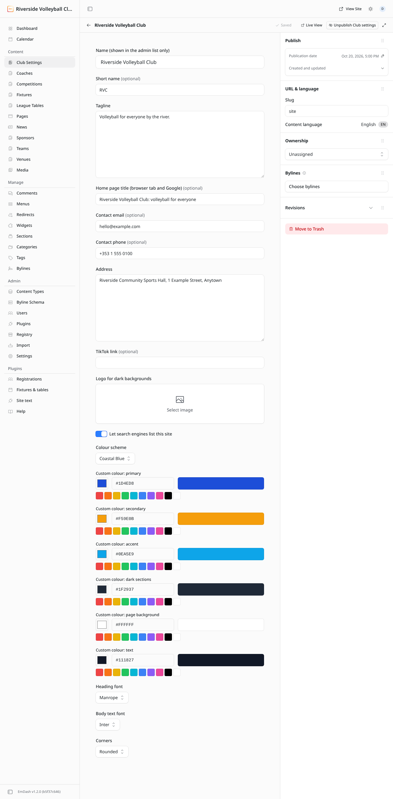
Club Settings (top of the Content menu) holds everything about the club that the built-in Settings don't: the tagline, contact details, and the site's look. There is exactly one Club Settings entry: open it, change it, and click Publish changes.
About the club
| Field | What it does |
|---|---|
| Name (shown in the admin list only) | Just a label for the admin. |
| Short name | A short form of the club's name, e.g. "RVC". Used where space is tight. |
| Tagline | One line under the club's name, e.g. "Volleyball for everyone by the river." Also the site's description in Google if a page has none. |
| Home page title | The browser tab and Google title of the home page. |
| Contact email | Where contact-form messages are sent, and shown on the Contact page. |
| Contact phone / Address | Shown on the Contact page and in the footer. |
| TikTok link | Adds a TikTok icon to the footer. |
| Logo for dark backgrounds | A light version of the logo, used on dark parts of the page such as the footer. |
| Let search engines list this site | On for a live site. Turn it off only to keep the whole site out of Google. |
Colours
Colour scheme picks a ready-made set of colours that are checked to be easy to read: Coastal Blue, Crimson Court, Forest Volley, Midnight Smash, Sunset Spike, Royal Block, Lakeside Teal, Steel & Cyan, Heritage Maroon, Mint Rally, Pacific Sand or Volcano Black.
To use your club's own colours, choose Custom colours (set below) and set the six colours with the pickers (click the swatch, or type a hex code such as #1D4ED8):
| Colour | Used for |
|---|---|
| Primary | Buttons, links, highlights. Usually the club's main colour. |
| Secondary | Second accents, e.g. badges. |
| Accent | Small touches of contrast. |
| Dark sections | Dark bands such as the footer. |
| Page background | The page behind everything. Usually white or nearly white. |
| Text | Body text. Usually nearly black. |
The website protects readability: if a colour combination would make text hard to read (say, white text on yellow), it adjusts the text colour automatically. If something looks different from what you chose, that's why: try a darker or lighter shade.
Fonts and corners
- Heading font and Body text font: pick from the list. A bolder font for headings and a plain one for text usually works best.
- Corners: how rounded buttons, cards and images are, from Square to Very rounded.
Publish, then open the site to check. Try a few combinations: you can always change them back.